Back in October, Yglesias reported on how the Trump stock market rally wasn't all that impressive. Other countries' stock market indices had risen by more than ours had. To illustrate this, he included this graph comparing the US S&P 500 with Japan's Nikkei, Germany's DAX, and France's CAC indices:
/cdn.vox-cdn.com/uploads/chorus_asset/file/9537663/Screen_Shot_2017_10_25_at_2.48.29_PM.png)
It clearly shows that, while the S&P500 has risen considerably since Aug 2016, the rise is not as large as the gains experienced by other countries. He concluded:
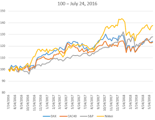
Well, time to investigate! Compare if you will the following graphs with three different normalizations: Yglesias' end-of-July 2016, the election in 2016, and the inauguration in 2017. I'm extending the data out to today, using weekly closing numbers.

If we normalize just before the election, however, we see that the US is right on par with Japan and outperforming Europe by a wide margin.
And normalizing from the inauguration shows the US ahead of every other country with the most boring and competent seeming Germany performing worst.
So what's the takeaway? We need more crazy antics? I doubt it. My three lessons for today are about how little we know:
1) If you're going to do this kind of analysis, be forthright about why you are choosing your starting dates. Starting dates are everything. That's part of why statistics gets its reputation for lies: you can make the same numbers tell almost any story you want. If you want US stock returns to look as bad as possible, start at July 3, 2016 (really close to Yglesias' starting point) so that Japan is 20 points ahead of the US. If you want the US stock returns to look as strong as possible, go back nearly 3 years ago to June 28, 2015 and give Trump credit for growth that happened during Obama's term, putting the US 20 points ahead of Japan. Or maybe just pick a credible day from which we can justly and reasonably judge the President's performance.
2) Let's please remember on all sides that the stock market is not a great indicator of how the economy as a whole is doing. The correlation may even be negative in the very long run (http://www.businessinsider.com/equity-returns-and-gdp-per-capita-2014-2)
3) Let's not draw too many life lessons about how to run an economy and a presidency until all the data points are in.
It clearly shows that, while the S&P500 has risen considerably since Aug 2016, the rise is not as large as the gains experienced by other countries. He concluded:
That said, the fact that stock market enthusiasm over the past year has been worldwide with the United States lagging other key countries seems like a strong indication that Trump hasn’t done anything that’s particularly successful or exciting. ... For whatever reason, markets are up just about everywhere, not only in the United States. And markets generally seem to be up by more in countries with boring, competent-seeming leadership than they are in the United States.I liked the graph and it is a good idea to think in terms of such counterfactuals, but I also had my doubts. Why normalize all the indices at the end of July, half a year before he became president and months before he won the election? In the middle of the semester I felt it was interesting enough to mention to my honors students while bringing up a concern or two, but I eventually forgot my desire to investigate further.
Well, time to investigate! Compare if you will the following graphs with three different normalizations: Yglesias' end-of-July 2016, the election in 2016, and the inauguration in 2017. I'm extending the data out to today, using weekly closing numbers.

The S&P's relative performance has improved since Yglesias wrote, so that even using his normalization the US is now modestly outperforming Europe and has been for the most part since the Tax Cut and Jobs Act. The Nikkei is still outperforming the S&P by a wide margin, but his conclusion would now have to be that the President's antics haven't harmed the US.

If we normalize just before the election, however, we see that the US is right on par with Japan and outperforming Europe by a wide margin.

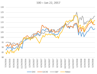
And normalizing from the inauguration shows the US ahead of every other country with the most boring and competent seeming Germany performing worst.
So what's the takeaway? We need more crazy antics? I doubt it. My three lessons for today are about how little we know:
1) If you're going to do this kind of analysis, be forthright about why you are choosing your starting dates. Starting dates are everything. That's part of why statistics gets its reputation for lies: you can make the same numbers tell almost any story you want. If you want US stock returns to look as bad as possible, start at July 3, 2016 (really close to Yglesias' starting point) so that Japan is 20 points ahead of the US. If you want the US stock returns to look as strong as possible, go back nearly 3 years ago to June 28, 2015 and give Trump credit for growth that happened during Obama's term, putting the US 20 points ahead of Japan. Or maybe just pick a credible day from which we can justly and reasonably judge the President's performance.
2) Let's please remember on all sides that the stock market is not a great indicator of how the economy as a whole is doing. The correlation may even be negative in the very long run (http://www.businessinsider.com/equity-returns-and-gdp-per-capita-2014-2)
3) Let's not draw too many life lessons about how to run an economy and a presidency until all the data points are in.
No comments:
Post a Comment