Country names that sound like band names (Doghouse Diaries)
Size of Africa compared to other countries and continents
Size of Africa's economy compared to the rest of the world: as large as Chicago + Atlanta
It's not red states vs. blue states, but red states vs. blue cities
A unbiased measure of countries where you can find "mostly good people."
Color-coded US map showing where people say "soda" vs. "pop" vs "Coke" - very true for myself and the Lovely and Gracious.
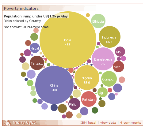
World poverty
and a map based on the names of countries (my favorite: Ca-Nada)


No comments:
Post a Comment